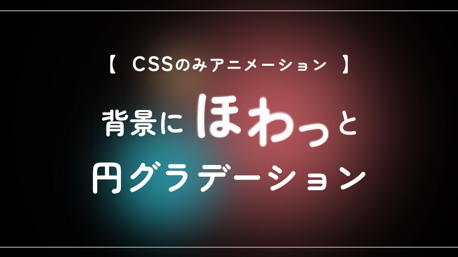

背景にグラデーションをつけたいけど、いつものじゃもの足りない・・・!
そんな時に使用できる背景グラデーションのcssです。
目次
コードのサンプル
See the Pen
round-gradation_sample by 竹中エムトラッド (@zxmnwqcp-the-reactor)
on CodePen.0
すぐに使用したい場合はこちらからコード確認ができます。
※プレビューがこちらのサイトで見るとかなり小さく見えずらいので、右上の [EDIT ON CODEPEN] を押してみてください!
動きの仕組み解説
HTML
<div class="gradation01">
        <div class="item item-01">
            <div class="round round-01"></div>
        </div>
        <div class="item item-02">
            <div class="round round-02"></div>
        </div>
        <div class="item item-03">
            <div class="round round-03"></div>
        </div>
        <div class="item item-04">
            <div class="round round-04"></div>
        </div>
</div>
gradation01: 背景をつけたい部分の大枠
item: 画面中央に配置するための基準と、回転アニメーション用
round: 中身のポワポワ丸設定と、点滅アニメーション用
CSS
.gradation01{
  /* 背景の枠とはみ出た部分を非表示に設定 */
  position: relative;
  overflow: hidden;
  width: 100%;
  height: 100vh;
  background-color: #000;
}
.item {
  /* 回転位置の設定 */
  position: absolute;
  top: 50%;
  left: 50%;
  width: 50%;
  height: 50%;

  /* 回転アニメーション */
  transform-origin: 0 0;
  animation-name: rotate-item;
  animation-timing-function: linear;
  animation-iteration-count: infinite;
}
.item-01 {
  z-index: 3; /* 円の重ね順の設定 */
  animation-duration: 15s; /* 15秒かけて回転 */
}
.item-02 {
  z-index: 2;
  left: 45%;
  animation-duration: 50s;
  animation-direction: reverse; /* 回転アニメーション反転 */
}
.item-03 {
  z-index: 4;
  left: 40%;
  animation-duration: 8s;
}
.item-04 {
  z-index: 1;
  animation-duration: 10s;
}
/* 円の設定 */
.round {
  position: relative;
  border-radius: 50%;
}
.round-01 {
  z-index: 3;
  top: 0%;
  width: 18vw;
  height: 18vw;
  background: #f57379;
  filter: blur(50px); /* ぼかし具合 */
  animation: flash 5s linear infinite; /* 5秒かけて点滅 */
}
.round-02 {
  top: -20%;
  width: 30vw;
  height: 30vw;
  background-color: #29C2D7;
  filter: blur(80px);
  animation: flash 8s linear infinite;
}
.round-03{
  top: 60%;
  width: 3vw;
  height: 3vw;
  background-color: #FADC90;
  filter: blur(20px);
  animation: flash 3s linear infinite;
}
.round-04{
  top: -70%;
  left: -60%;
  width: 40vw;
  height: 40vw;
  background-color: #eee6ff30;
  filter: blur(150px);
  animation: flash 10s linear infinite;
}

/* 回転アニメーション */
@keyframes rotate-item {
  0%   { transform: rotate(0deg); }
  100% { transform: rotate(360deg); }
}
/* 点滅アニメーション */
@keyframes flash {
	0%,
	100% {
		opacity: 0.8;
	}
	50% {
		opacity: 0.5;
	}
}
item、roundの位置の調整によって、同じ軌道にならずにそれぞれがずれて移動してくれます。
点滅を入れることでさらにふんわり光っている印象になります。
動きの位置や時間差の微調整でいろんな使い方ができそうだよ
背景が他の色だとまた違った印象になりそうだ、、!
参考にしたサイト
▼ 円を描くCSSアニメーション
▼ コピペで使用OK!円のグラデーションジェネレーター
注意点!
重い、他のJSと相性が悪くなある可能性があるため、事前にチェックしましょう
アコーディオンなどの、画面幅が可変するものを一緒に使用すると、この背景cssも固定のなかで動いているのでバッティングしてしまう場合があるようです!